Colour
You may have been shocked to see that I had blended the browns of the last colour scheme so poorly that there was a ruddy great line across the middle of the first post. I can only claim ignorance.
It turns out that Apple's Safari web browser has a far higher colour pick up than either Firefox or Internet Explorer (at least the versions I have installed on my PowerBook). So what looked perfectly peachy on my screen would have looked perfectly beastly on yours. It is rather like colour-blindness for machines. I apologise for that design slip. Thanks to Adobe and Wikipedia I think I have remedied the problem.
I have also added a pic of Paul Newman as Brick down on the sidebar because I couldn't let that profile slip into the achive of this page.
Please let me know if any other design faux-pas have slipped though.
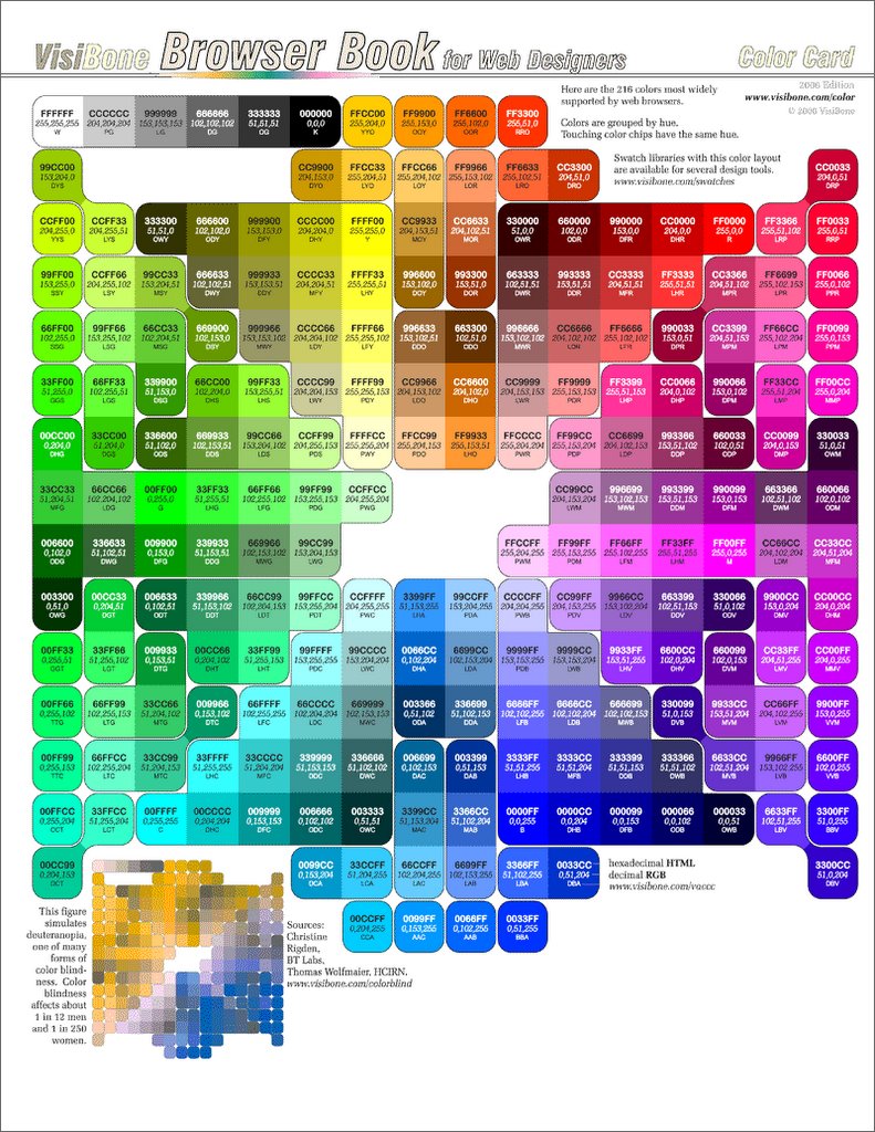
If you want to read up on the intricate world of web colours then check out this excellent post from webmonkey.
(Thanks to visibone for the pic above!)
UPDATE: Thanks Neil for the pretty picture of how unpretty the new look looked in Firefox for the sight-impaired. All fixed now?
Tags: colour, color, design
posted by walypala @ 9:44 pm
![]()
![]()

0 Comments:
Post a Comment
<< Home